
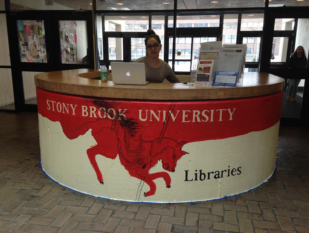
Those who braved the mountains of snow generously gifted to us by recent passerby Blizzard Jonas (thanks a lot, Jonas!) may have noticed something new and wonderful in the Melville Library Galleria. The neutral toned horseshoe-shaped counter that serves as an information desk by day was considered an eyesore by some and an architectural mystery by others. But regardless of how you may have formerly perceived this desk, it has been transformed over the winter break into a work of art, designed and executed by our own student employee and resident artist, Peter Groffman.
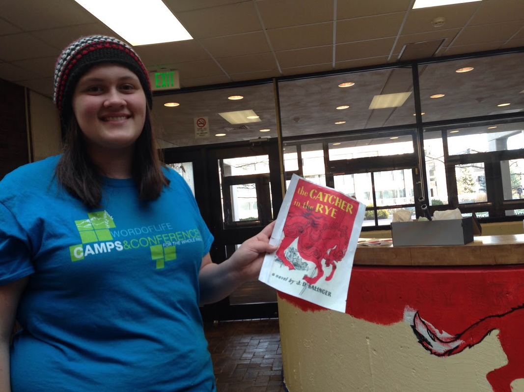
Groffman and his cousin, Julianna Johnson, worked tirelessly to bring his vision to life. The result is an interpretation of the cover of The Catcher in the Rye, J.D. Salinger’s classic novel that has been found on lists compiling some of the best novels ever written, as well as lists of the most commonly banned and challenged books throughout history. It is not the first time imagery from this text has been used in Stony Brook University Libraries’ marketing. The carousel horse that symbolizes a key moment in the book was used on the buttons that advertised our 3rd Annual Library Scavenger Hunt. The reasoning for this is detailed here. Quotes from the text also appeared on the walls of the Central Reading Room last year as we honored ALA’s Banned Books Week.
Library staff compiled a few questions for Groffman to try to get a sense of what his inspiration was for his design that substituted a seawolf, the school’s mascot, for the carousel horse found on the cover. He could have taken this opportunity to slyly pull a Caufield by responding more vaguely with some variation of Salinger’s famous quote, “I don’t know what I mean by that, but I mean it”, but he was more thoughtful and obliging in carefully detailing his inspiration and overall experience.
- What about The Catcher in the Rye inspired you to incorporate its cover in the service desk design?
 Well, libraries lend books, so naturally I went with a book design. I tried to choose one that was recognizable to some degree. I originally wanted to do something from Orwell’s Animal Farm or Camus’ The Stranger, but, looking back, now I am certain nobody would have understood the references. I chose The Catcher in the Rye because I remember seeing a lot of truth in the novel when I read it in high school, and for the practicality of the design. The reference wasn’t too obscure, and the artwork could stand on its own apart from the novel; those who get it can enjoy it for what it is, and those who don’t can enjoy it as another piece of bizarre SBU sea wolf art. I had many people come up to me while I was painting: some made the connection [more than I thought would initially], most did not, however, whether from unfamiliarity with the novel or the novel’s cover art, and just wanted to compliment the mural. With that said, I also had one woman ask why that dog has a pike through its head. I’m paraphrasing. I thought it was funny though.
- What was your overall experience of the design or painting process? Did it go as you had envisioned?
The design process is the most difficult and important step in producing the mural. A small amount of 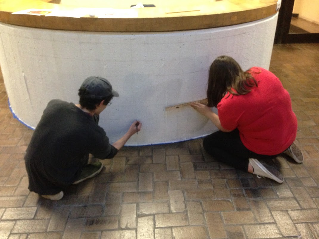 planning saves hours’ in making and covering mistakes on the large scale. Precise measurements and a grid were essential, especially in the lettering, and the face of the wolf. In regards to the painting process it was difficult to duplicate the crisp lines with all of their sharp turns, and stroke deviations on the coarse, porous surface of the desk. I did my best to achieve that continuous, illustrative, crow quill quality, but it’s very difficult to make something look sketchy, and spontaneous, as though it was rendered with a swift hand and ink, using careful, tedious strokes and acrylic. The only comparable example I can think to offer is the difference in appearance when you sign your name quickly, from when you sign your name slowly. A slow signature will never quite have the dynamic, indifferent, fluency of a quick signature.
- What does it mean to you to have something you created out in the open for everyone to see?
 I like having made a mark on Stony Brook. I like to leave a consistent trail of breadcrumbs wherever I go because it makes for a good autobiography. I’m uncertain as to the significance of it being viewed by the public. If anything I hope it serves as an advertisement for The Catcher in the Rye, which, as aforementioned, I think contains a lot of truth, or at least I remember thinking so in high school.
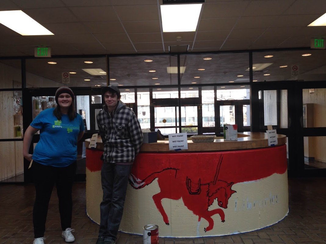
Groffman, pictured above on the right, will complete his design’s finishing touches over the course of the next few weeks. We hope you’ll stop by to see it if you haven’t already. Bring your questions with you – our Information Desk is in service again for the semester, Monday-Thursday 10AM-3PM.
“What really knocks me out is a book that, when you’re all done reading it, you wish the author that wrote it was a terrific friend of yours and you could call him up on the phone whenever you felt like it. That doesn’t happen much, though.”
― J.D. Salinger, The Catcher in the Rye
Latest posts by Kristen Cinar (see all)
- Pi-Day Honors the Delicious Side of Mathematics - March 14, 2016
- Mathletes & Foodies Rejoice! Pi-Day Returns to the Library - March 10, 2016
- SBU Libraries: Yes, we also do matchmaking! - February 12, 2016